How to Design a Business Logo That Scales
How to Design a Business Logo That Scales

You can design an effective business logo yourself in a few focused steps that produce scalable files for web and print. Here's the short version before we go deep:
- Write a one-page design brief (audience, values, tone).
- Sketch 3–5 rough concepts on paper.
- Pick one direction and build it digitally in a tool like Canva, Adobe Express, or Figma.
- Export vector files (SVG, PDF) plus raster versions (PNG with transparency, JPG).
- Test across real use cases: social avatar, website header, business card.
Required file assets to produce:
- SVG (scalable vector, for web and developer handoffs)
- PDF (print-ready vector)
- PNG with transparent background (web, presentations)
- JPG (email, photos, platforms that reject transparency)
Pro Tip: If your logo needs to work across packaging, signage, and a full brand system from day one, hire a pro. If you need a clean, functional mark for a single business under a tight budget, DIY is a legitimate route.
Key Takeaways
A well-designed business logo requires a written brief, a vector master file, and real-world testing before you call it final.
| Point | Details |
|---|---|
| Start with a brief | Write your audience, values, and use cases before opening any design tool. |
| Vector files are non-negotiable | Export SVG and PDF for print and developer handoffs; PNG for web and social. |
| Test at 16px and reversed | A logo that fails at small sizes or on dark backgrounds will fail in the field. |
| USPTO fees start at $350 per class | Budget separately for trademark filing and a clearance search if protection matters. |
| Amigolabz delivers the full package | Logo design, brand strategy, and export-ready files with digital marketing support included. |
How to design a business logo: the step-by-step workflow
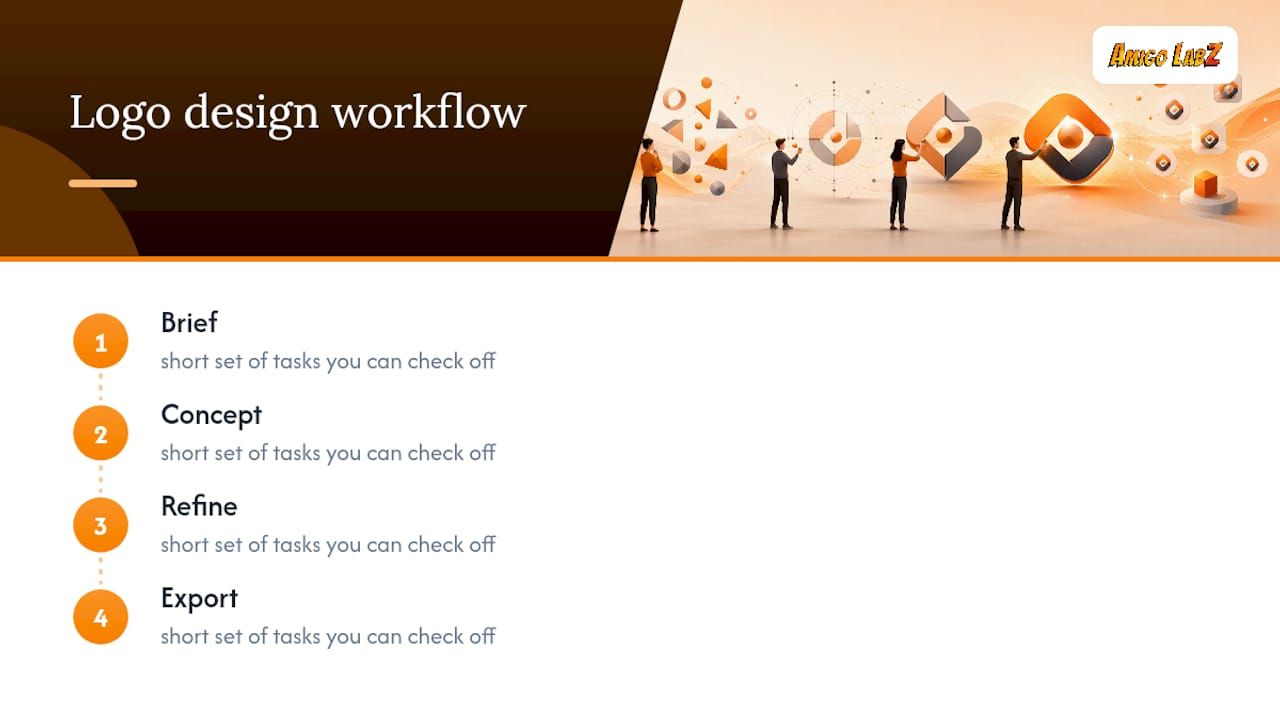
A practical logo design workflow moves through four phases: brief, concept, refine, and export. Each one has a short set of tasks you can check off.
Phase 1: Write your design brief
Before you open any tool, answer these questions in writing:
- Who is your customer, and what do they already trust visually?
- What three adjectives describe your brand (bold, approachable, technical)?
- Where will the logo appear first: website, app, storefront, packaging?
- What competitors' logos should yours look nothing like?
One page is enough. The brief keeps you from chasing every idea that looks interesting.
Phase 2: Sketch and select concepts
Spend 20–30 minutes sketching thumbnails by hand. Aim for at least five rough directions. Then pick three to develop further using a mood board (pull reference images from Dribbble, Pinterest, or Google Images). Time-box this phase to one day maximum.
Pro Tip: Limiting yourself to three concept directions forces real decisions. Founders who explore ten directions rarely finish; founders who commit to three usually ship.
Phase 3: Build digital mockups and refine
Move your chosen concept into your design tool. Focus on:
- Shape and proportion (does it read at small sizes?)
- Spacing between letterforms and icon elements
- Alignment on a grid
Produce at least two variations: a horizontal lockup and a stacked version. Keep the icon separate as a standalone mark.
Phase 4: Finalize and export
Once the design is locked, produce the full export checklist from Section 5. Hand the SVG and PDF to any printer or developer; keep the PNG set for digital use.
What makes a logo actually effective?
Five principles separate logos that last from ones that date quickly. Good logo design consistently returns to the same core rules.
- Simplicity. A logo with fewer elements is easier to recognize and reproduce. Think of the marks you can draw from memory in ten seconds.
- Memorability. One distinctive element, repeated consistently, sticks. Two competing focal points cancel each other out.
- Scalability. The mark must read clearly at 16px (a browser favicon) and at 10 feet (a banner). Test both extremes before finalizing.
- Relevance. The visual language should connect to your industry and audience without being a cliché of it. A law firm doesn't need scales; a bakery doesn't need wheat sheaves.
- Versatility. The logo must work in full color, single color, reversed on dark backgrounds, and in black-and-white. If it only works in one context, it will fail in the field.
A logo is not decoration. It is a recognition system. Every element that doesn't help a customer identify you faster is an element that slows them down.
Pro Tip: Avoid the three most overused symbols in your industry. If every competitor uses a shield, a house, or a lightbulb, your version of that symbol will always read as generic, no matter how well it's drawn.
How to choose colors and typography that communicate your brand
Color is the fastest signal your logo sends. Before picking a palette, map your brand adjectives to color associations: orange and coral read as energetic and approachable; navy reads as trustworthy and established; black reads as premium or technical. Match the feeling, not just the trend.
Color rules that hold up in practice:
- Choose one primary brand color, one or two neutrals, and a single accent. Three core colors maximum.
- Check contrast ratios. Text or icon elements on a background should meet at least a 4.5:1 contrast ratio for legibility (the Web Content Accessibility Guidelines standard).
- Test your palette at avatar size (roughly 40×40px). If the colors blur together, simplify.
- Avoid gradients in the primary mark. They disappear in single-color print and embroidery.
Typography follows similar logic. A serif font signals tradition and authority; a geometric sans-serif signals modernity and clarity. For most small business logos, a clean sans-serif paired with a secondary weight of the same family is enough.
Typography dos and don'ts:
- Do: verify the font has a commercial license before using it in a logo you plan to trademark.
- Do: test legibility at 12px before committing to a typeface.
- Don't: use hairline-weight fonts for any mark that will appear at small sizes or on textured surfaces.
- Don't: mix more than two typefaces in a single logo lockup.
Pro Tip: Run your logo through a free grayscale filter before finalizing colors. If the hierarchy and contrast still read clearly in gray, the color version will work everywhere.
Export checklist: which file formats do you actually need?
Vector formats are non-negotiable for a logo. A raster-only logo (just a PNG or JPG) cannot scale to billboard size without pixelating, and most printers will reject it for large-format work.
| Use case | File type | Notes |
|---|---|---|
| Website header / HTML embed | SVG | Scales infinitely; smallest file size |
| Print (business cards, signage) | PDF or EPS | Send to printer; preserves vector paths |
| Social media profile photo | PNG (transparent) | 1x and 2x sizes; square crop of icon mark |
| Email signature | PNG (white or transparent bg) | JPG if the email client strips transparency |
| TEAS trademark filing | JPG | Minimal white space; black-and-white if color not claimed |
Export checklist before you hand off files:
- SVG (master vector, web-ready)
- PDF (print-ready, embedded fonts outlined)
- PNG at 500×500px and 1000×1000px, transparent background
- JPG at 1000×1000px, white background
- Color specifications: HEX, RGB, and CMYK values documented
Pro Tip: The USPTO requires a JPG image with minimal white space for a design mark filing. Prepare this file separately from your standard marketing assets and keep it at 300 DPI.
Which design tool fits your skill level and budget?
The right tool depends on how much control you need versus how fast you need to ship.
- Canva is the fastest route for beginners. Its free tier includes hundreds of logo templates and drag-and-drop editing. The paid Pro plan ($15/month) unlocks SVG export and a brand kit. The catch: templates must be customized to avoid producing a mark identical to another business's. Canva's terms also restrict exclusive trademark rights for some stock and AI-generated assets, so read the license before filing.
- Adobe Express sits between Canva and professional tools. The free tier covers basic logo creation; the paid plan integrates with Adobe Creative Cloud and exports cleaner vector files. Better for someone already in the Adobe ecosystem.
- Figma gives you the most design control of the three without requiring a full Illustrator subscription. The free tier is generous. The learning curve is steeper than Canva, but the output is closer to professional-grade, and the file-sharing workflow makes freelancer handoffs easy.
- Vistaprint is not a design tool in the same sense. It's a print-and-ship service with a built-in logo maker. Use it if you need business cards and a basic mark in one transaction. Don't use it as your primary design environment if you need scalable files for a full brand system.
Pro Tip: Before you trademark or sell anything featuring a logo built in a template tool, verify that every font and icon asset carries a commercial use license. Some free font families and stock icons prohibit use in trademarked marks.
How to test your logo before you call it final
A logo that looks good in your design tool can fail in the real world. Run these checks before locking the design.
Legibility and contrast tests:
- Scale the logo to 16px wide. Can you still read the mark or icon?
- Place it on a white background, a black background, and a mid-gray. Does it hold up on all three?
- Convert to single color (all black, all white). Does the design still communicate?
- Print a thumbnail at business-card size and hold it at arm's length.
Feedback and mockup steps:
- Drop the logo into a real mockup: a business card template, a social media profile photo frame, and a website header.
- Share the mockup (not the raw file) with three to five people outside your company. Ask: "What does this business do?" and "How would you describe the style?" Their answers reveal whether the logo communicates what you intend.
- Run a quick A/B test on an Instagram story or email header if you have two strong directions. Real engagement data beats internal debate.
- Note which elements generate confusion or questions. Those are the ones to revise; leave the elements that land correctly alone.
How long does this take, and what does it cost?
DIY: A focused founder can produce a usable logo in four to eight hours spread across two days. Add another day for feedback and revisions. Total cost: free to roughly $100 for paid assets, a premium font license, or a paid Canva subscription.
Freelance designer: Expect one to two weeks for a professional freelancer working through a platform like Fiverr or Upwork, or directly. Rates range from $200 to $2,000 depending on experience, number of concepts, and deliverables included.
Small agency: Two to six weeks, starting at roughly $2,000 and climbing significantly for full brand identity systems.
What drives cost up:
- Custom typography (a bespoke typeface adds hundreds to thousands of dollars)
- Number of revision rounds included
- Whether a brand guidelines document is part of the scope
- Number of logo variations and file formats delivered
- Trademark clearance search (attorney flat fees plus USPTO filing fees)
Budget separately for a USPTO trademark clearance search if the logo will represent a business you plan to protect. USPTO filing fees start at $350 per class of goods or services, and attorney fees for a clearance search add to that total.
U.S. trademark basics every logo owner should know
Using a logo in commerce gives you common-law trademark rights in the geographic area where you operate. Federal registration through the USPTO gives you nationwide protection and the right to display the ® symbol. For most small businesses planning to grow beyond a local market, federal registration is worth the investment.
Practical steps to file a design mark:
- Run a clearance search using the USPTO's TESS database and Vienna Classification codes (design-code searching, not just name searches).
- Decide between a standard character mark (word only) and a special form mark (the actual logo design). Most businesses file both.
- Choose your filing basis: use in commerce (if the logo is already in use) or intent-to-use (if you're filing before launch).
- Prepare your specimen: a real-world example of the logo in use (a website screenshot, a product label).
- Upload a clean JPG of the logo with minimal white space. File in black-and-white unless you are specifically claiming color as part of the mark, because a black-and-white registration covers the design across all color variations.
Filing in black-and-white gives broader protection. A color-specific registration covers only those exact colors, meaning a competitor could use your design in a different palette and potentially avoid infringement.
Trademarks protect brand identifiers like logos as source identifiers, while copyright protects original artistic works. Both can apply to a logo, but they are separate legal protections with different registration processes.
Owning the design file is not the same as owning an enforceable trademark. A logo must be distinctive, not merely decorative, to qualify for registration. Consult an IP attorney if your mark is in a crowded category or if the clearance search returns similar results.
Where to source custom typography and icons
If you want a logo that no template can replicate, custom type and original icons are the fastest route to distinctiveness.

For typography: Google Fonts and Adobe Fonts both offer large libraries with clear commercial licenses. For a truly custom wordmark, a type designer can modify an existing letterform or draw one from scratch. Expect to pay $500–$3,000 for a custom letterform modification from a freelance type designer. Sites like Fontspring and MyFonts sell retail licenses for premium typefaces with explicit commercial use terms.
For icons and marks: Hire an illustrator on Dribbble or Behance for a custom icon. Alternatively, tools like Noun Project offer licensed icons, but verify the license tier (Basic vs Pro) before using one in a trademarked logo. SVG files from these sources can be imported directly into Figma or Illustrator for refinement.
Always confirm: does the license permit use in a trademarked mark? Some platforms explicitly prohibit it for stock or AI-generated assets.
Common logo design mistakes to avoid
Most logo problems come from the same short list of errors.
- Too many elements. A logo with a gradient, a drop shadow, three fonts, and a complex illustration will fail at small sizes and in single-color applications.
- Trendy over timeless. Neon gradients and ultra-thin letterforms look current for 18 months, then date the brand.
- Skipping the brief. Designing without a written brief produces a logo that looks fine but communicates nothing specific about the business.
- Ignoring file formats. Delivering only a PNG is one of the most common DIY mistakes. A printer or developer will ask for a vector file, and rebuilding the logo from a raster image is expensive.
- Copying a competitor's visual language. If your logo could belong to any of your three closest competitors, it belongs to none of them.
- Assuming ownership equals trademark rights. Creating the file does not automatically grant enforceable trademark protection. Distinctiveness and a proper clearance search matter more than who drew it.
When and how to iterate on your logo based on feedback
Iteration works best when it is structured, not open-ended. Set a clear feedback window (one week maximum), define who has final say, and limit revision rounds to two or three.
When to iterate: if feedback consistently points to the same problem (illegible at small sizes, wrong tone, too similar to a competitor), that's a signal to revise. One person's personal preference is not a signal.
How to iterate without losing momentum:
- Collect all feedback in one document before making any changes.
- Categorize each note as functional (the logo doesn't work in a specific context) or preferential (someone doesn't like the color).
- Fix functional issues first. Address preferential feedback only if it aligns with the original design brief.
- Present revised versions as mockups on real assets, not as isolated files on a white background.
- Lock the design after round two. Endless iteration is how logos never get finished.
How to find and hire a professional logo designer
Start with a clear scope document before you contact anyone. Know your budget, your timeline, the number of concepts you want, and the file formats you need at delivery.
Where to find designers: Dribbble and Behance show actual portfolio work, which is more useful than a designer's self-description. Upwork and Fiverr work for budget-conscious projects; expect to pay more for designers with strong portfolios and clear processes.
Key questions to ask before hiring:
- Can I see three to five logos you've designed for businesses in a similar category?
- What does your process look like from brief to final files?
- How many concepts and revision rounds are included?
- What file formats will you deliver, and do you outline fonts before handing off?
- Do you retain any rights to the final design, or does full ownership transfer to me?
A designer who can't answer the last question clearly is a risk. Get the ownership transfer in writing. Also confirm that any fonts or icons used in the logo carry commercial licenses you can use in a trademark filing.
For integrated brand and web design support, working with an agency that handles both the logo and the digital presence avoids the common problem of a great logo that doesn't translate to the website.
DIY or hire: an honest take on which route actually fits you
The conventional wisdom says "hire a pro if you can afford it." That's not wrong, but it's incomplete. The real question is whether the logo is a strategic asset or a functional placeholder right now.
A DIY logo built in Canva or Figma is a legitimate choice for a business in its first year, testing a market, or operating on a lean budget. The tools are good enough. The templates, customized properly, produce clean marks. The mistake is treating a template logo as permanent when the business outgrows it.
Hiring makes sense when the logo is part of a repositioning, when you need a full brand system (guidelines, multiple lockups, packaging specs), or when the mark will be trademarked and you want a clearance search built into the process. At that point, the cost of a professional is the cost of not redoing the work in 18 months.
Three quick criteria to decide right now: if you answered yes to "I have a clear brief, a simple mark concept, and a budget under $200," do it yourself. If you answered yes to "I need this to work across packaging, signage, and a full digital presence from launch," hire a pro. If you're somewhere in the middle, start with a DIY draft and use it to sharpen the brief before paying a designer.
Amigolabz handles the logo and the brand system for you
Designing a logo yourself is genuinely doable. But if you want a mark that's built for a full digital presence from the start, Amigolabz delivers logo design alongside the brand strategy, export-ready file sets, and the social media management that puts the logo to work across every channel.

Amigolabz works with small businesses and entrepreneurs across the country from offices in New Jersey and Nevada. The agency's approach starts with your brand brief, moves through concept and refinement, and ends with a complete file package and a clear path to grow your brand online. No guesswork about what files you need or whether the mark will hold up in print.
Book a free call to talk through your logo project and get a fixed-scope quote.
Sources
The USPTO's free TESS database and Vienna Classification system are the starting point for any logo trademark clearance search. Use them before filing, not after.
FAQ
What is the golden rule for logo design?
Simplicity. A logo should communicate one clear idea and remain legible at any size, from a 16px favicon to a large-format banner.
Can I design a logo for free?
Yes. Canva and Adobe Express both offer free tiers with logo templates and basic export options. The main limitation is that free tiers typically restrict SVG export, and some stock assets carry licensing terms that limit trademark eligibility.
What is the best program to design a logo?
Canva is the fastest for beginners; Figma offers more design control with a generous free tier; Adobe Express works well for anyone already in the Adobe ecosystem. For print-and-ship in one step, Vistaprint's built-in logo maker covers basic needs.
What are five rules for creating a good logo design?
Simplicity, memorability, scalability, relevance, and versatility. A logo that passes all five tests will work across a social avatar, a business card, signage, and a website header without modification.
How much does a professional logo design cost?
DIY tools cost free to roughly $100 for paid assets. A freelance designer typically runs $200–$2,000 depending on experience and deliverables. A small agency starts around $2,000 for a full logo and brand identity package.
Recommended